Círculo Creativo Day
25 ideas
The system
The client gave us an existing logo. From it, we had to develop a complete graphic and motion system that could live on multiple screens throughout the event.
Celebrating creativity in all its forms.
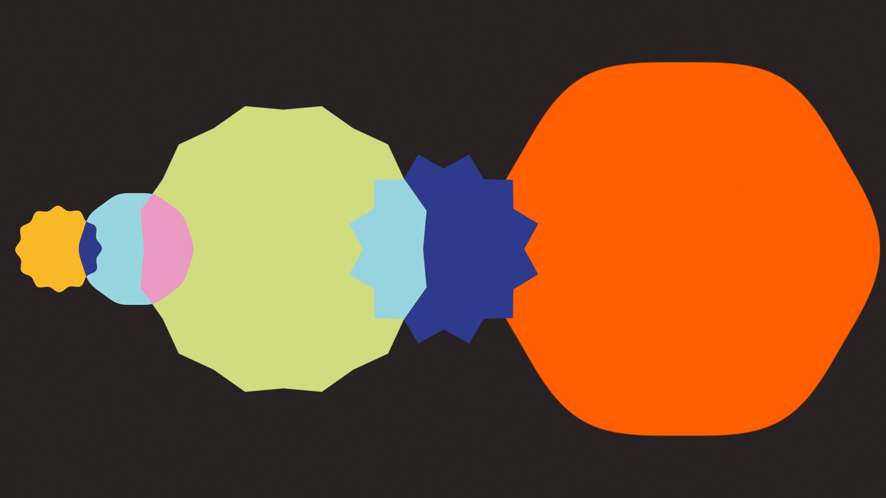
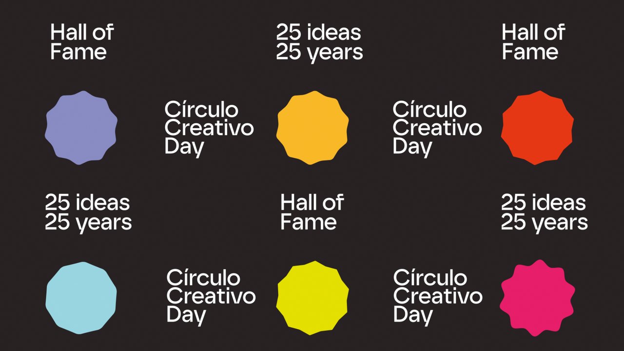
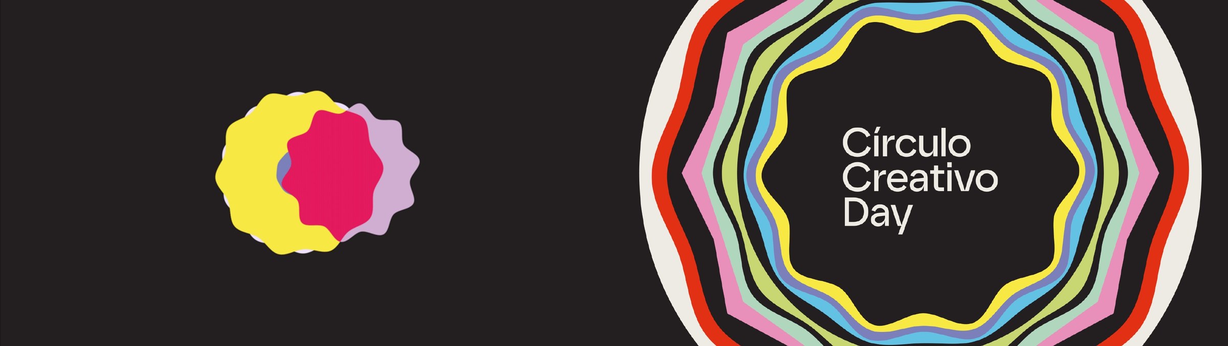
The event logo was built from 25 different circular forms, each with its own shape, spikes and color. That came straight from the idea behind the event: for its 25th anniversary, the association presented and recognized the 25 best ideas of the past 25 years.
Our concept was to give each idea its own circle, a visual identity that belonged to that idea alone. But we wanted that individuality to go beyond the final shape, so each circle was also revealed through a different animation, with its own movement and transformation.
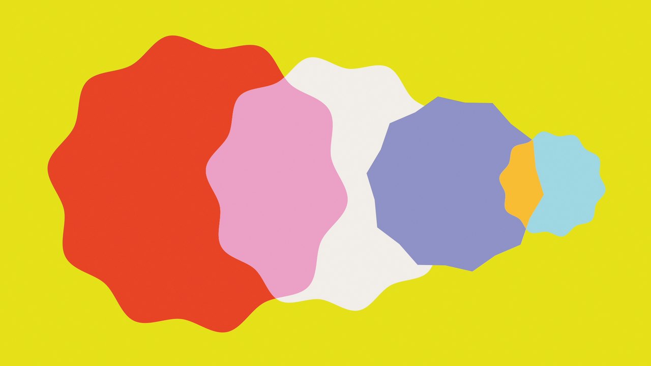
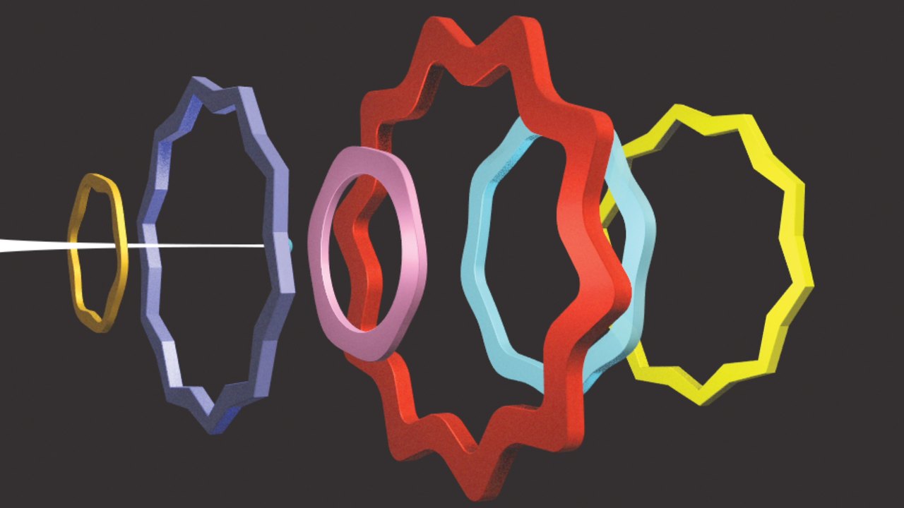

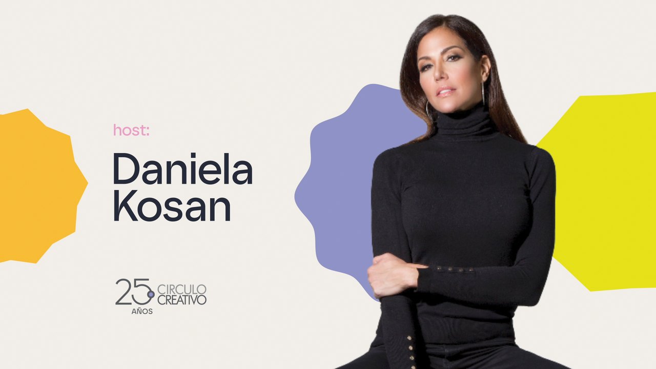

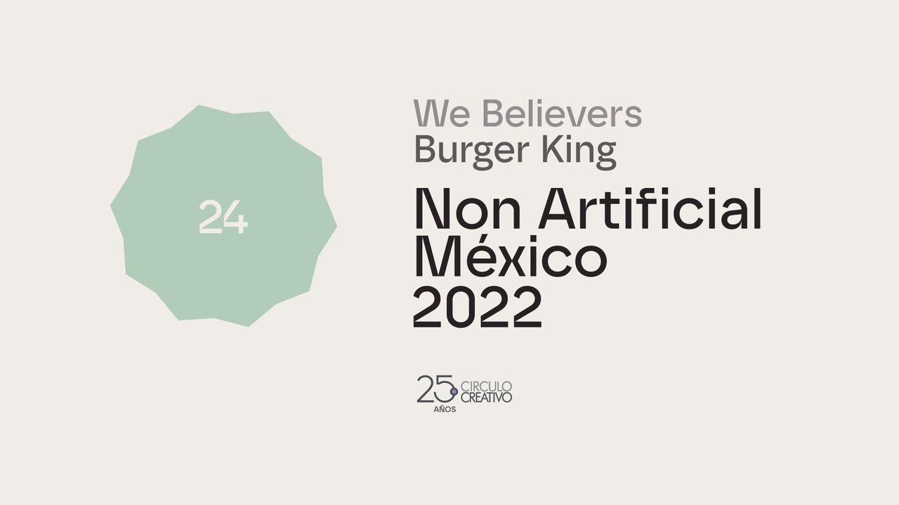
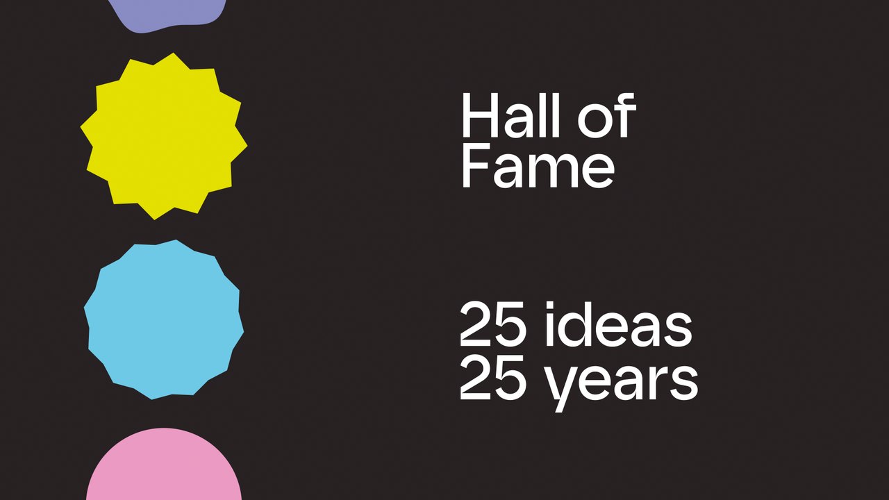
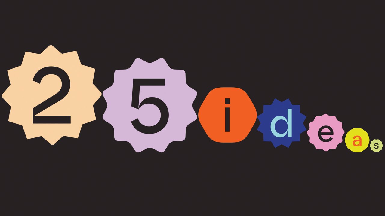
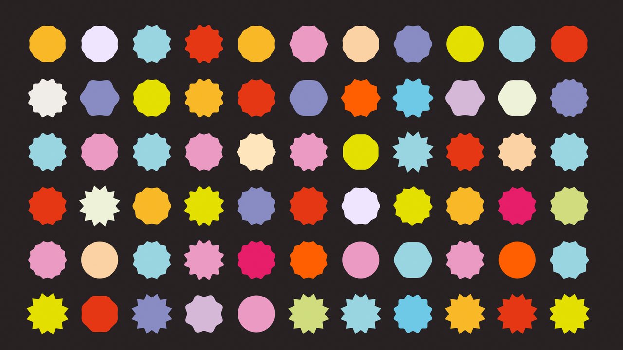



The result was a colorful, highly modular system, designed to look alive on screen and also to be fast to produce, easy to adapt and flexible enough for the scale of a live show.
The challenge was not only visual. It was also operational. The show needed a large volume of assets in a very limited time. The system had to feel varied and full of movement without every asset being designed and animated from scratch. The answer was already inside the logo.
Its identity was built from a colorful collection of circles and irregular shapes that come together to form a larger symbol. We read each of those elements as an individual creative idea: different in shape, color and personality, but part of the same creative universe.
From there, we built a system in which each idea could behave on its own. They appear, move, connect, overlap, separate and reorganize. Sometimes one of them takes the lead. Sometimes they interact with each other. In the end, they come back together to rebuild the Círculo Creativo logo.
We directed the visual production of the show. How it would be shown, and how we would get it made, came out of many working sessions within our team. There were even more meetings with the Círculo Creativo team.


2140 South Dixie Highway, Suite 208
Miami, Florida 33133
contact@rightcutmedia.com+1 (305) 479-2929Right Cut Media Inc.